
The Brutally Honest Guide to a Website That Actually Works
- Cat Markel

- Feb 9, 2025
- 5 min read
Why Your Website Sucks (And How to Make It Awesome)

You ever walk into a store and immediately feel lost? Like, there’s no signage, the layout makes no sense, and you’re just standing there wondering where to go?
That’s how a bad website feels.
And if people feel that way when they land on your site? They’re gone before you even had a chance to say, “Hey, wait! I can help you!”
Let’s fix that. Here are some website design tips to make a website that converts.
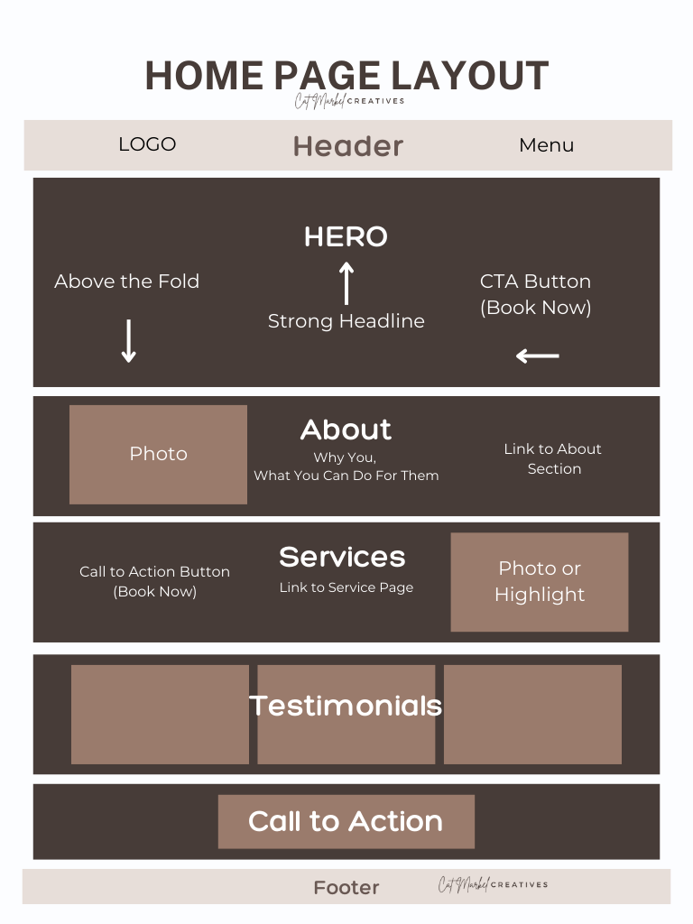
Your Homepage: First Impressions Matter (A Lot)
AKA... How to structure a homepage for conversions
Your homepage is prime real estate. It’s gotta do two things: grab attention and tell people what to do next. If it doesn’t, you’ve already lost them.
What Should Be Here?
✔ Hero Section. The first thing people see should include your headline, subheading, CTA, and a striking visual.
What is a Hero Section and Why It Matters?
The hero section is the very first thing people see when
they land on your website—it’s your website’s handshake.
It’s the place where you introduce yourself, clarify what
you do, and guide visitors toward action. It should be all
above the fold (what they see on the screen without
scrolling down.)
✔ A clear, direct headline. No fluff, no riddles. Just tell them what you do and how it helps them.
Example: “Helping coaches automate their business so they can earn more and work less.”
🚫 What NOT to do: “Unlocking your potential through synergistic business solutions.” (What does that even mean?)
✔ A Short Subheading – Reinforce your value. Answer why people should care.
✔ A simple call-to-action. What do you want them to do? Book a call? Join your email list? Pick ONE and make it obvious.
✔ A photo or video that connects. If you’re a personal brand, show your face. If you sell something, show it in action.
✔ A Sneak Peek Into Your About Page – A short, engaging snippet about you with a link to your full story.
✔ A service preview. Give a quick taste of what you offer, with a link to the full details.
✔ Social proof. A testimonial, client logo, or review can instantly build trust.
✔ Email Opt-in. Capture leads with a freebie, like a guide or checklist, in exchange for an email.
✔ Easy Contact Info. Whether it’s a button or a chat feature, make it effortless for visitors to get in touch.
Think of your homepage like a friendly, efficient receptionist. It should greet visitors, give them clear options, and point them in the right direction—without making them work too hard.
Your About Page: It’s Not Just About You
Creating a compelling About page
We need to talk about About pages. Because a lot of people get these wrong.
Your About page is not just a biography. Yes, share your story, but make it matter to your audience. They need to see themselves in your story.
What Works?
✔ Hook them with something relatable. Open with a sentence that makes them nod their head, thinking, “Oh wow, that’s me.”
➡️ Example: “If you’re anything like me, you started your business because you wanted more freedom—but instead, you feel chained to your laptop 24/7.”
✔ Explain why you do what you do. Not just the what, but the why. What makes you different?
✔ A touch of personality. Fun facts, a behind-the-scenes look, or a quirky detail make you memorable.
✔ A call-to-action. Yes, even here. Guide them to the next step (like booking a call or signing up for your list).
If someone reads your About page and still doesn’t know how you can help them? It’s time for a rewrite.
The Must-Have Pages That Make You Look Legit
Essential elements of a great website
Besides your Home and About pages, these are non-negotiable:
✔ Services/Work With Me Page – Spell it out. What do you offer? How does it work? Make it easy to understand.
✔ Contact Page – No one should have to hunt for a way to reach you. Include an email, a form, and maybe even a calendar link if you book calls. Let me repeat that…INCLUDE YOUR EMAIL and NOT JUST A FORM. Seriously.
✔ Blog (If You Want to Boost SEO) – Not required, but if you want to show off expertise and improve search rankings, it helps.
The Details….
Navigation: Don’t Make People Think Too Hard
Best practices for website navigation
Imagine a restaurant with a menu that has 27 sections and 15 subcategories. Overwhelming, right? Your website shouldn’t feel like that.
Keep it simple:
✔ 5-6 main menu items max. Home, About, Services, Contact, Blog (if you have one). That’s it.
✔ Use clear, straightforward labels. Call it “Services,” not “My Toolbox of Magic.” Cute can be confusing.
✔ Make it easy to get in touch. Your Contact page should be in the main menu. No one should have to search for how to reach you.
Fonts, Colors, and Readability: Make It Easy on the Eyes
Website font and color accessibility guidelines
Let’s talk design. Ever been to a website where the text was tiny, squished, or in some hard-to-read cursive? Yeah, don’t do that. Because no matter how great your content is, if it’s hard to read, no one’s sticking around.
Fonts & Text Size
✔ Two fonts max. One for headlines, one for body text. Keep it clean and professional.
✔ No tiny text. Body text should be at least 16px. Headlines? 28px or bigger.
✔ Avoid fancy script fonts. They look cool but are a nightmare to read on mobile.
✔ Make Sure It’s Legible – Script fonts might look cute, but if people struggle to read them, they’ll just leave.
Colors and Accessibility—Because Not Everyone Sees Like You Do
Choosing Colors That Work
✔ Stick to 2-3 main colors. One primary, one secondary, and maybe an accent.
✔ Use high contrast. Black text on white is perfect. Light gray on white? Instant eye strain.
✔ Make buttons stand out. If your call-to-action blends into the background, it’s useless.
The Footer: Your Website’s Closing Statement
The footer is the unsung hero of your website. It’s like the back cover of a book—often overlooked, but super important.
Why Your Footer Matters
✔ It’s always visible, so it’s a great place for essential info.
✔ It gives visitors a last chance to take action before they leave your site.
✔ It reinforces your credibility by housing legal, trust, and contact details.
What Should Be in Your Footer?
✔ Contact Info. Make it easy for visitors to reach you. Include your email, phone (if applicable), and social links.
✔ Quick Navigation. A condensed version of your menu (Home, About, Services, Contact).
✔ Social Media Links. Give visitors an easy way to connect with you outside your site.
✔ Legal Links. Privacy policy, terms of service, or disclaimers if needed.
✔ A Final Call-to-Action. Whether it’s “Schedule a Call” or “Join My Email List,” give people a reason to stay connected.
A well-structured footer makes your website feel polished and professional while keeping visitors engaged.

A good website isn’t just pretty—it works. It helps people find what they need, builds trust, and makes taking action easy. If yours isn’t doing that, let’s fix it.
Not sure where to start? I got you. Book a free website review, and let’s make your site actually work for you. 🚀


Comments